2 Exploratory Spatio-temporal Data Analysis and Visualisation
2.1 Introduction
In this section, we will introduce the tools and techniques for exploratory spatial-temporal data analysis (ESTDA). Exploratory data analysis (EDA) aims to explore datasets characteristics and generate hypotheses by means of graphical methods such as histograms, box-plots and scatterplots. To apply these techniques, we are going to explore the characteristics of selected 28 road links of the London Congestion Analysis Project (LCAP).
ESTDA is the extension of EDA to spatio-temporal data. Time-series analysis and spatial data analysis methods are used separately to examine whether the data are correlated and stationary in time and space. The goal is to develop an understanding of the data by revealing key relationships and processes. According to Cheng and Haworth (2019), among the objectives of ESTDA are included:
- maximising insight into a dataset
- uncovering underlying structure
- extracting important variables
- detecting outliers and anomalies
- testing underlying assumptions
- developing parsimonious models (simplest model that can achieve a certain performance level).
In this chapter, we will be applying a data-driven approach by making a list of data components and then transforming them into graphics. To explore the data, a methodological pathway must be taken. First by tidying the data, which means to store in a regular form in accordance with the semantics of commands be applied. Once the data is tidied, a common step is to transform the data. Transformation includes narrowing in on observations of interest, eventually creating new variables and calculating a summary statistics. And finally, visualisation techniques is also a common approach to knowledge generation. A good visualisation answer or even raise new questions about the data.
2.2 Examining Data Patterns and Characteristics
To examine how data vary in space and time we need to explore their general characteristics. Here is important to distinct descriptive analysis to predictive analysis. The former involves describing the data, summarizing large amount of data into meaningful statistics. In contrast, explanatory analysis aims to explain the relationships between variables to test causal relationships (see Singleton and Folch 2018). The observation of a variable or index at two or more locations over time comes to form a space-time series.
The first step we need to take prior to any command is to load the data to the space environement and to install some required packages. An R package is a collection of functions, data and documentations that extends the capabilities of base R. To install an R package, you might use a single line of code:
install.packages ("package")
You might type that line of code in the console and then press ENTER to run it. R will download the packages from CRAN and install them onto your computer. Once the package is installed, you can load it with library() function.
The basic information about a package is provided in the description file, where you can find out what the package does, who the author is, what version the documentation belongs to, the date, the type of license its use, and the package dependencies. You can also access the description file inside R with the command packageDescription("package"), via the documentation of the package help(package = "package") or online in the repository of the package.
# set working directory accordingly with setwd()
# install if necessary using 'install.packages'
library(readxl)
library(rgdal)
library(lattice)
library(dplyr)
library(tmap)
library(tmaptools)
library(readxl)
library(knitr)
# the package starima is not available on rcran
# you must install directly from the working directory using the command 'install.packages'
install.packages("starima_package.R")# load the data to the space environement
load("forecasting.RData")
tts <- read_excel("tts.xlsx",
sheet = "transpose", col_names = TRUE)To introduce the fundamentals of ESTDA, we will explore the technique to 28 road links selected within the London Congestion Charging Zone (CCZ).6 Within this area, a fee is charged on most motor vehicles operating in Central London between 07:00 and 18:00 Mondays to Fridays. It is not charged on weekends, public holidays or between Christmas Day and New Year’s Day.
An example of road link shape is presented in figure 2.1.
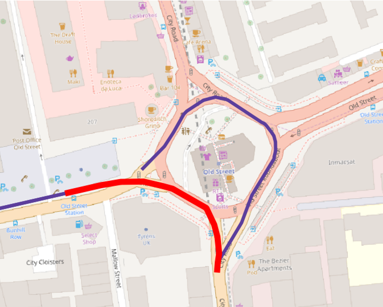
Figure 2.1: Road Link ID 2061
We then need to select the road links IDs from the data matrix UJT.
UJT.chosen <- UJT[ ,c("1745","1882","1622","1412","1413","1419","2090","2054","2112",
                      "2357","2364","2059","2061","2062","2358","2361","2363","2084",
                      "2086","2097","2318","2344","2087","2088","2089","2282","2102","473")]
Also, we need to clean shapefile LCAPAdj to the chosen road links.
LCAPShp.chosen <- LCAPShp[LCAPShp$LCAP_ID %in% c("473","1622","2344","1745","2090","2054","2112","2357","2364",
                                                 "2059","2061","2062","2358","2361","2363","2084","2086","2097",
                                                 "2318","2087","2088","2089","2282","2102","1882","1412","1413","1419"), ]
To display the subset of the network roads extracted from the LCAP network, we can use the code tm_shape() to specify the dataset to map. The second part, tm_lines(), specifies that we want to plot line data. We can also add additional elements and change the way elements are displayed using the + operator followed by a function.
tmap_mode(mode ="view")## tmap mode set to interactive viewing tm_shape(LCAPShp.chosen) +
tm_lines(col="LCAP_ID", style="cat", palette="Accent", lwd=3.5)+
tm_layout(legend.bg.color = "white",
legend.frame = "black")## Linking to GEOS 3.6.1, GDAL 2.2.3, PROJ 4.9.32.2.1 Non Spatio-temporal Data Patterns
Before we examine how the data vary in space and time, we should explore their general characteristics. A very simple first step is to start by calculating the mean and standard deviation.
mu = mean(UJT.chosen)
mu
## [1] 0.2109794sdev = sd(UJT.chosen)
sdev## [1] 0.139087Next, a histogram of the length of the selected road links can be calculated and plotted on a histogram (figure 2.2). A histogram divides the data into groups of equal size and plots the number of observations (frequency) occurring in each group on the y-axis.
The mean as a vertical line is also displayed. The distribution of the data shows that road links present a wide range of length, falling in the range from 1000 to 2000 metres.
# setup a histogram road link length
hist(LCAPShp.chosen@data$LENGTH,
     main="Length of Road Links Histogram",
     xlab="metres",
     col="yellow")
abline(v=mean(LCAPShp.chosen@data$LENGTH), col="red")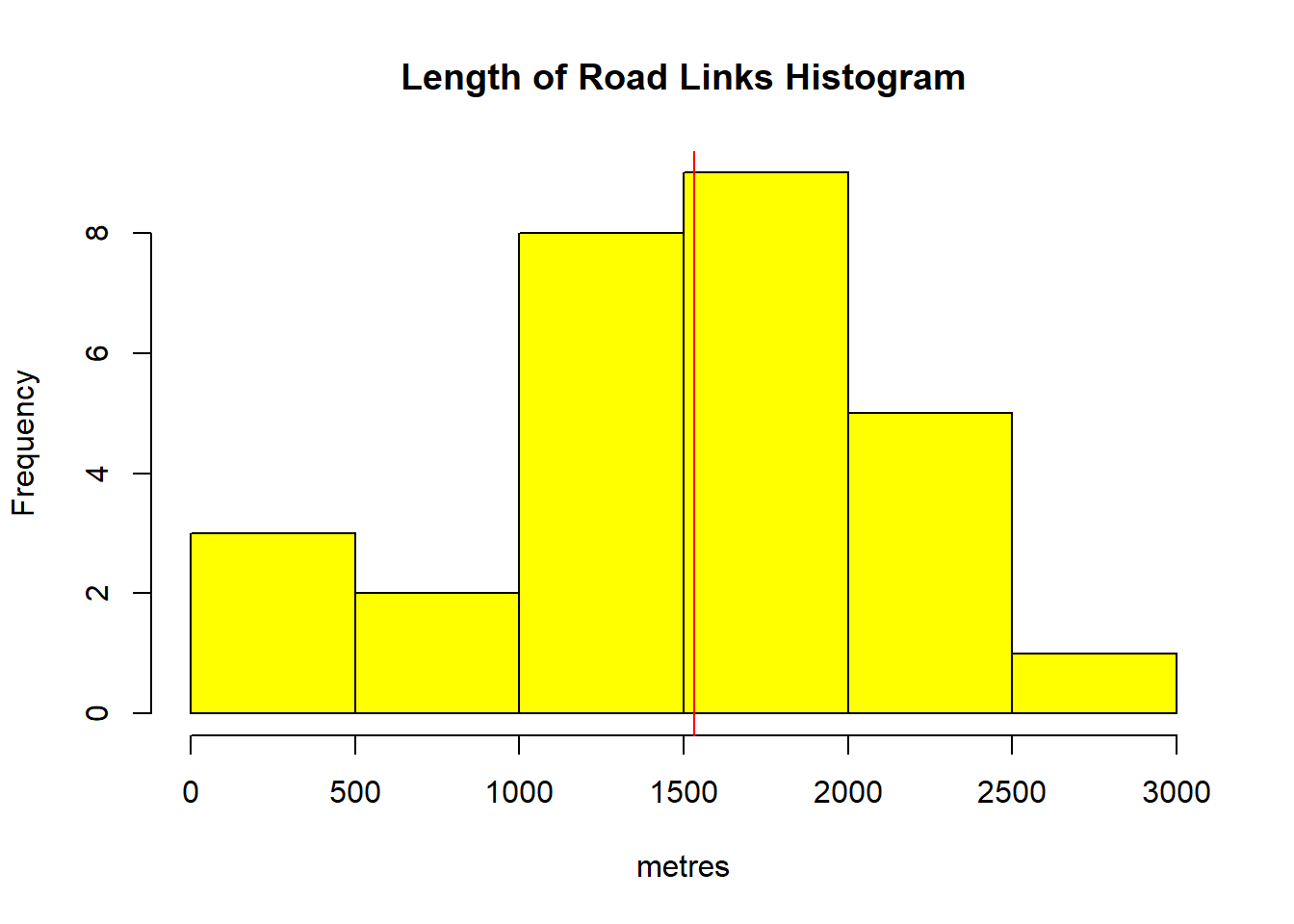
Figure 2.2: Histogram of link lengths and mean value shown in red line
Through our simple aspatial exploratory data analysis we have discovered that the data are not normally distributed. Some initial hypotheses might be drawn. Are the distribution been affected by heavy traffic flow? or it is a simple correlation to the lenght of the roads? Further investigations must be carried out.
To examine urban travel patterns, the unit of travel time (UTT) is a commonly applied index since it normalizes the TTs with the length of each road link. It is a well know index to study traffic flow. A boxplot in figure 2.3 illustrates the UTT distribution across the 28 links for a period of 30 days. The majority (for example road ID 2087, 2088 and 2112) presents low variation which suggests smoother traffic conditions, whereas a few links (e.g. 473, 2061 and 2062) exhibit high variation which might be related to traffic congestion.
# The next step is to examine the distribution of the data.
# Boxplot(UJT.chosen)
boxplot(UJT.chosen,  main="Aggregated UTT Boxplot",
        xlab="Road Link ID",
        ylab="seconds/metre",
        col="light blue")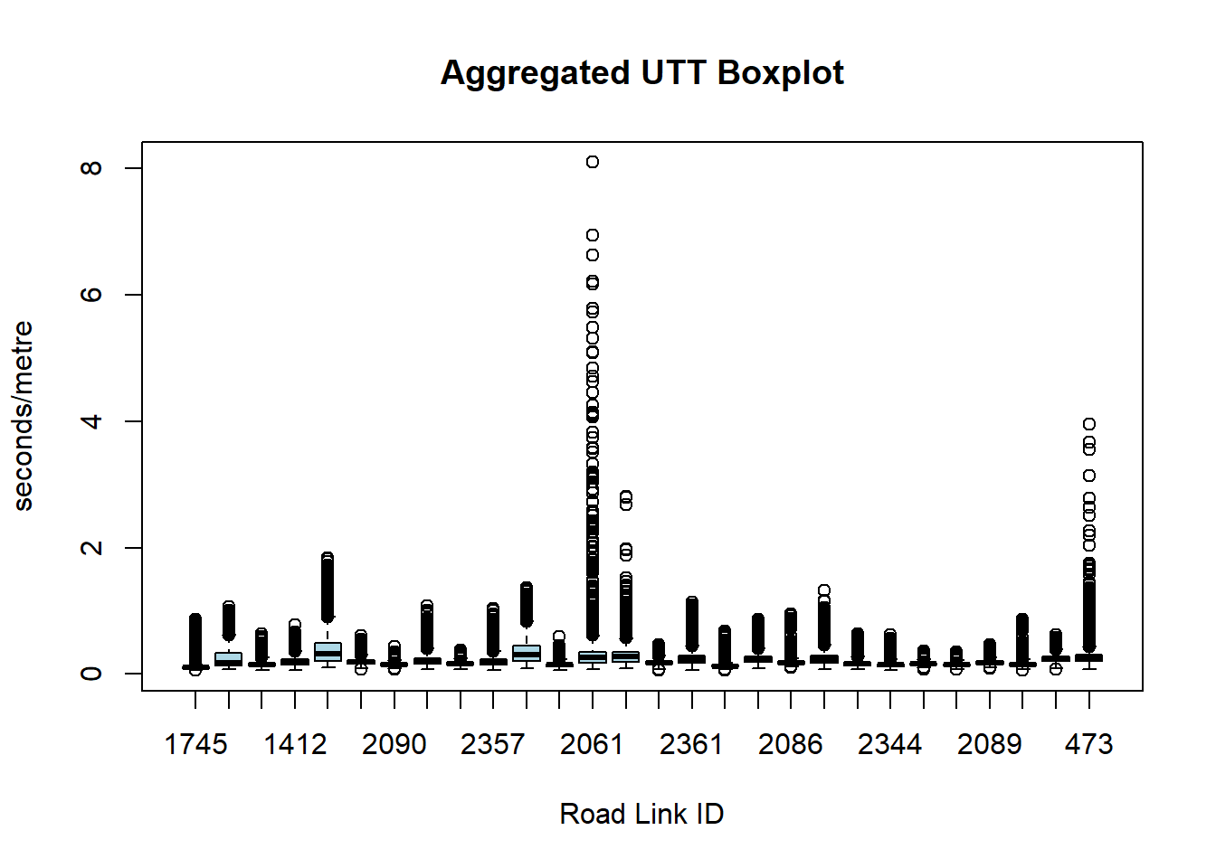
Figure 2.3: Boxplot with UTT within a 30 days period by road link ID
The nature of urban road traffic is quite different from traffic on highways because of traffic signals at intersections. The speed of the traffic stream on urban roads is determined by the interaction between the demand for road space and the supply of road space, known as capacity (Bell and Y.Iida 1997). Congestion is characterised by slow moving stop and go traffic. Congestion that results purely from the level of demand outstripping the capacity of the roadway is referred to as recurrent congestion. Recurrent congestion occurs on a daily basis and is determined by commuting patterns(Haworth 2013). The level of demand also varies between weekdays and weekends, resulting in different traffic patterns on different days of the week.
To investigate the distribution of the data, histograms of the UTT (2.4 and 2.5) can be created with the function hist() Note that you can define the visual property of the graph (for example the color, the size) with aesthetic property definitions. An aesthetic is a visual property of the objects on your graph.
it becomes clear that the data are not normally-distributed: most of the UTT lay between 0 and 0.5, and has a mean of 0.21 sec/m. The same histogram displays the upper end frequency and shows the index laying well above the mean at the tail.
# Histogram of the unit travel time with lower end frequency.
# Upper end frequency
hist(UJT.chosen,
     main="Aggregated UTT Histogram",
     xlab="seconds/metre",
     xlim=c(3, 10.0),
     ylim=c(0,15.00),
     col="yellow")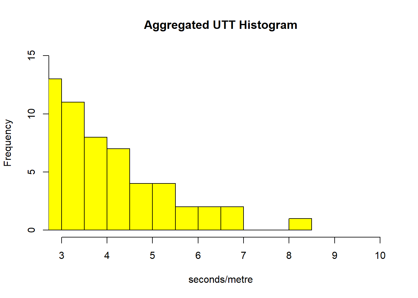
Figure 2.4: Histogram of the unit travel time with lower end frequency of UTT
# Histogram of the unit travel time with upper end frequency.
# Lower end frequency
hist(UJT.chosen,
     main="Aggregated UTT Histogram",
     xlab="seconds/metre",
     xlim=c(0, 4.0),
     ylim=c(0,170000),
     col="yellow")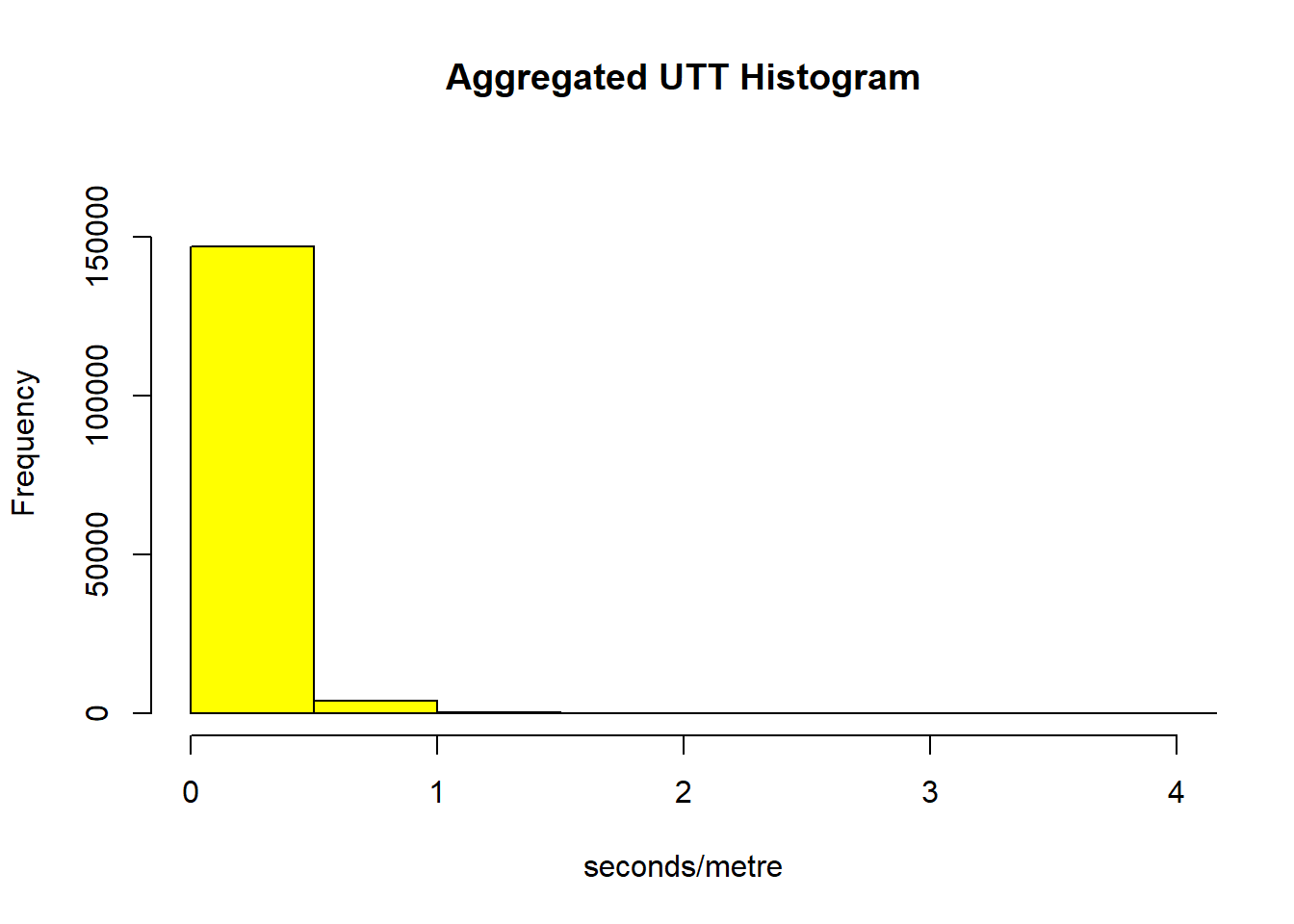
Figure 2.5: Histogram of the unit travel time with upper end frequency of UTT
Using a quantile-quantile (QQ) plot it is possible to better study how the distribution diverges from normality (see figure 2.6). The straight red line is the theoretical normal distribution (if the data were normally distributed, they would fall on this line). It can be seen that the distribution diverges from normal at its upper tail. This means that the UTT of some road links present much higher indices than the average. Probably, these roads lay in congestion areas with slow moving stop and go traffic.
# Using a quantile-quantile (QQ) plot we can examine how the distribution diverges from normality
qqnorm(UJT.chosen)
qqline(UJT.chosen, col="red")  # The straight red line is the theoretical normal distribution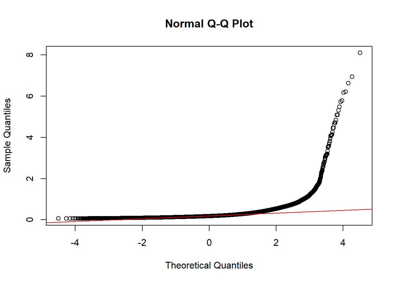
Figure 2.6: QQ-Plot of UTT in chosen road-links
Any hypotheses of UTT behavior so far must be analysed by looking at how the data vary in space and time. As a simple first step, matrix of scatterplots showing the relationship can be drawn as on figure 2.7. A scatterplot matrix is a collection of scatterplots organized into a grid. Each scatterplot shows the relationship between a pair of variables, in this case between mean UTT, road link length and time.
A conclusion can be reach with the scatterplot: there is a negative correlation between length and UTT. The unit of travel time is not defined by the length of the road. This is a common feature of urban traffic where heavy traffic leads to overcrowded roads with congestions and slow-moving stop and go traffic.
# Pairwise scatterplots
TIME <- LCAPShp.chosen@data$LENGTH*MeanUTT
pairs(~LENGTH+MeanUTT+TIME,data=LCAPShp.chosen@data,
main="Scatterplot Matrix") 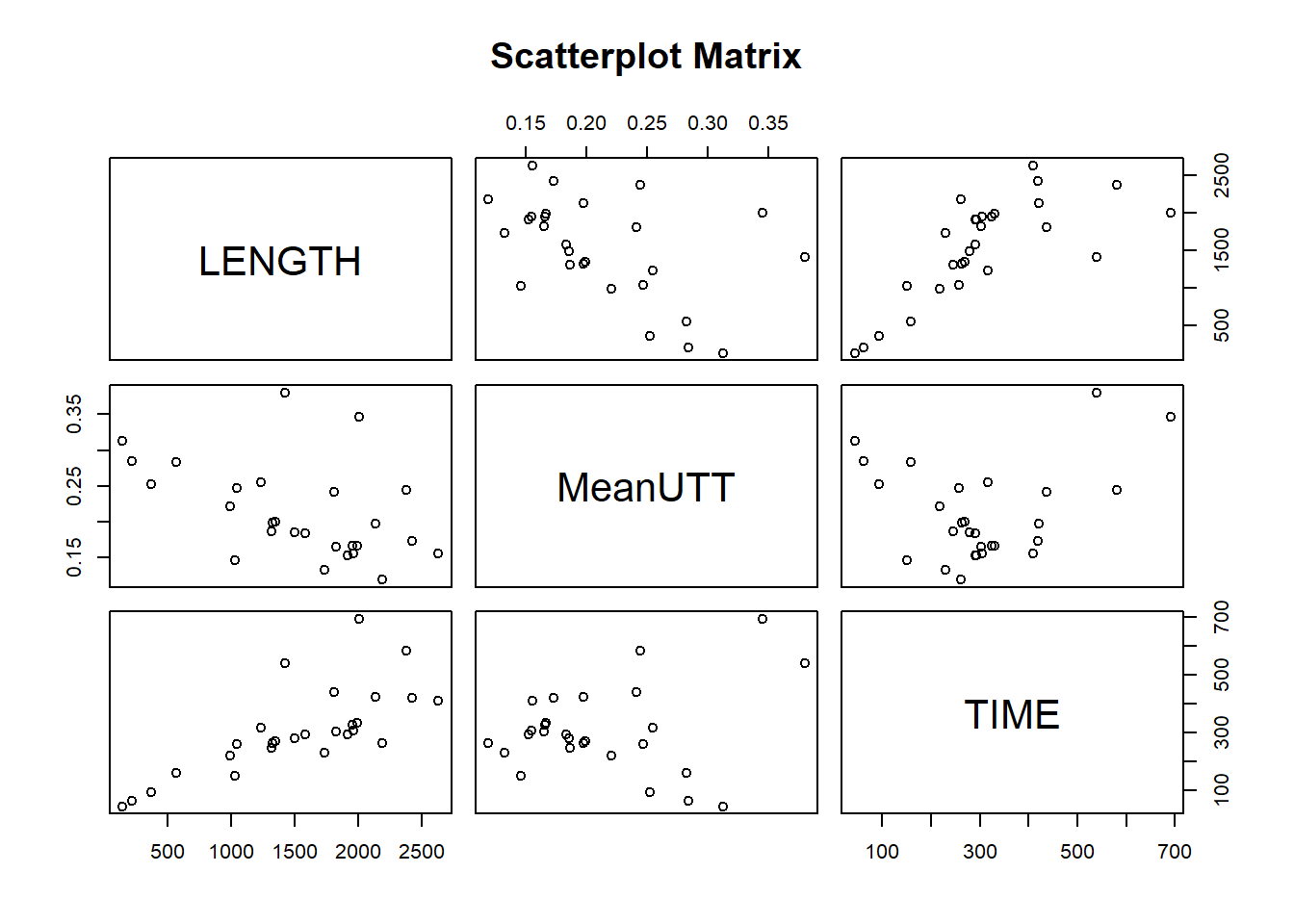
Figure 2.7: Pairwise scatterplots
Another way to explore this relationship further is by plotting mean UTT, length and time on a 3D plot. Two ways of doing this using different R libraries are shown in figures 2.8 and 2.9. The graphs ratify the principal conclusion already draw: the unit of travel time is negatively correlated with the length of the road, which imply heavy traffic as the main cause of higher travel time.
# Time
scatterplot3d(x=TIME, y=LCAPShp.chosen@data$LENGTH, z=MeanUTT, xlab="TTime [sec]", ylab = "Lenght[m]", zlab = "Mean UTT [sec/m]")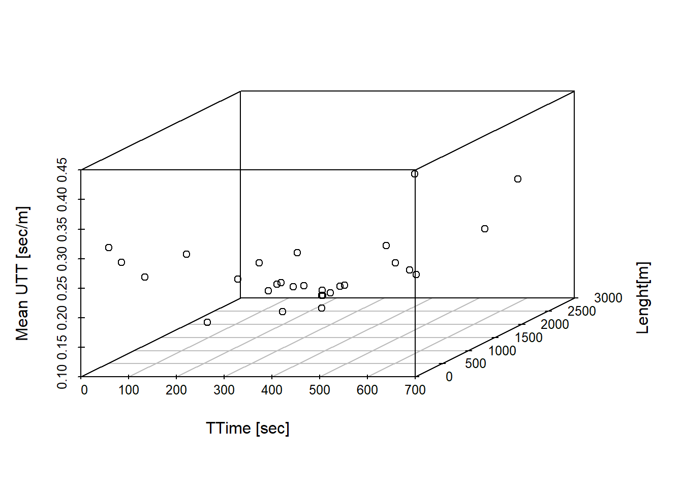
Figure 2.8: Scatterplots 3d with time on x axis
# Lengh
scatterplot3d(x=LCAPShp.chosen@data$LENGTH, y=TIME, z=MeanUTT, xlab="Lenght[m]", ylab = "TTime [sec]", zlab = "Mean UTT [sec/m]")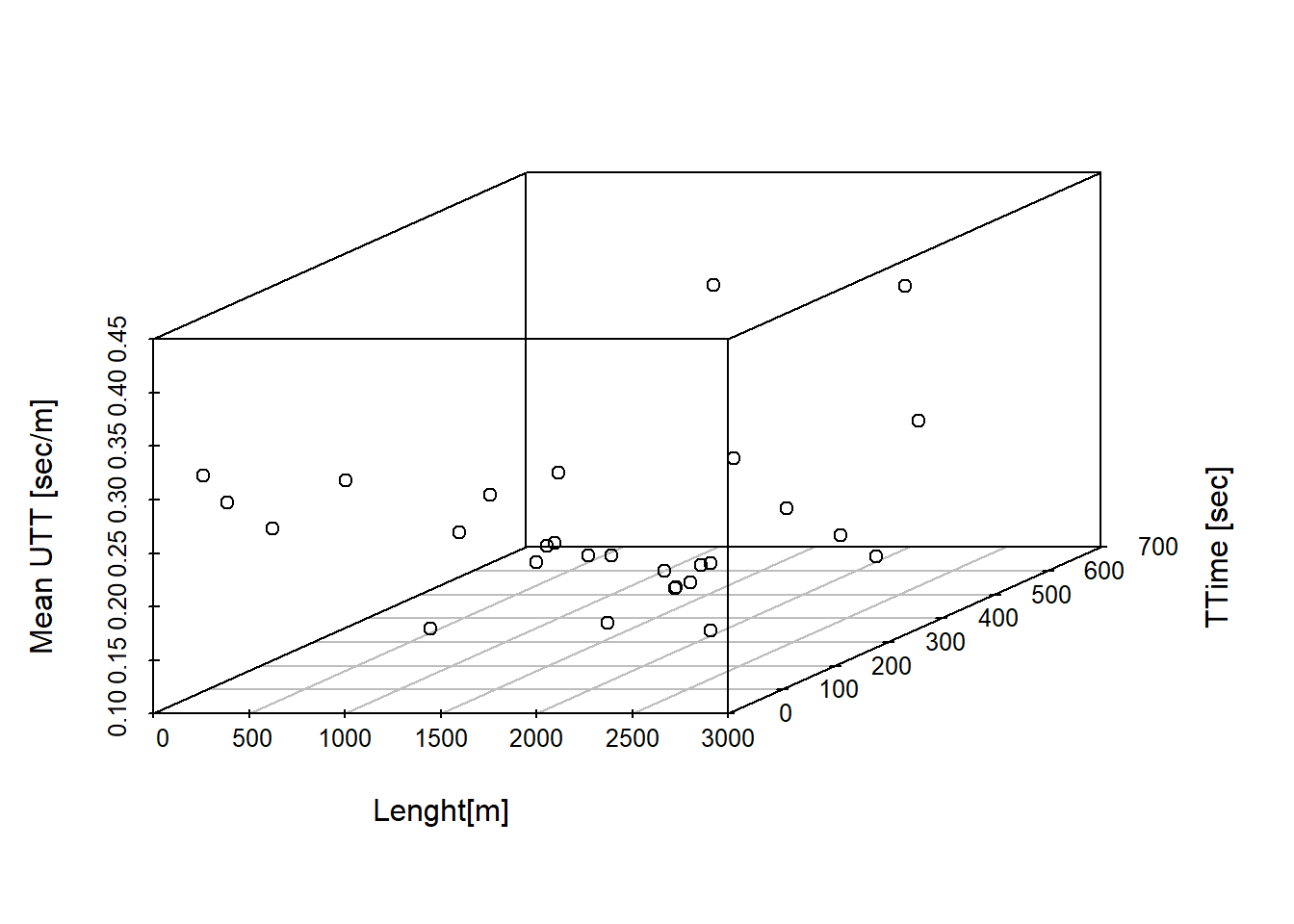
Figure 2.9: Scatterplots 3d with lenght on x axis
2.2.2 Temporal Patterns
The previous section provides a description of the date and introduces UTT as an index of traffic flow. It also shows that length of road link and UTT are not positively associated and that length and time are positively correlated. The daily patter of road links needs to be analysed next.
First load the following packages:
# install if necessary
library(plot3D)
library(plotly)
library(starma)
A line plot showing the daily UTT mean over a period of 30 days can be set up using the package Plotly for R. Plotly is an package for creating interactive web-based graphs.7 Here we have selected four road links to desmonstrate how you can set up the graph. Even though some road links present similar pattern, no clear conclusion can be drawn from the figure.
lcap <- read_excel("tts.xlsx",
                   sheet = "tts", col_types = c("numeric",
                                                "numeric", "numeric", "numeric",
                                                "numeric", "numeric", "numeric",
                                                "numeric", "numeric", "numeric",
                                                "numeric", "numeric", "numeric",
                                                "numeric", "numeric", "numeric",
                                                "numeric", "numeric", "numeric",
                                                "numeric", "numeric", "numeric",
                                                "numeric", "numeric", "numeric",
                                                "numeric", "numeric", "numeric",
                                                "numeric", "numeric", "date"))

f <- list(
  family = "Courier New, monospace",
  size = 18,
  color = "#7f7f7f"
)
x <- list(
  title = "Day",
  titlefont = f
)
y <- list(
  title = "Mean UTT [seconds/metre]",
  titlefont = f
)

lcap1h= aggregate(lcap, list(cut(lcap$datetime, "1 day")), mean)

p=plot_ly(x=lcap1h$Group.1, y=lcap1h$`473`,mode = 'lines', type="scatter", name="LCAP 473")  %>% layout(legend = f, xaxis =x, yaxis=y)
p <- add_trace(p,y=lcap1h$`1622`, name="LCAP 1622")
p <- add_trace(p,y=lcap1h$`2344`, name="LCAP 2344")
p <- add_trace(p,y=lcap1h$`1745`, name="LCAP 1745")
p
Figure 2.10: Time series of Mean UTT per day over 30 days.
2.3 Spatio-temporal Dependence and Autocorrelation
When performing spatial analysis, we need to undestand the level of spatial dependence in the area of interest we are studying. Spatial dependence relates to the level in influence of nearby locations values to a particular location or area of interest.
2.3.1 Temporal autocorrelation
In order to measure autocorrelation in temporal and spatial data, we use lagged variables, or past period values. Spatial autocorrelation is the correlation of a time series with itself, separated by a temporal lag. In time series analysis, spatial dependence is usually measured by means of the autocorrelation funcion (ACF), calculated for a set of number lags and displayed on an ACF plot. A temporal lag is the interval of time between two related phenomena (such as a cause and its effect).
Temporal autocorrelation is the correlation of a time series with itself, separated by a temporal lag. Temporal autocorrelation quantifies the extent to which near observations of a process are more similar than distant observations in time. A value of 1 indicates perfect positive autocorrelation, -1 perfect negative autocorrelation, and 0 a no autocorrelation.
The plot on figure 2.11 displays the level of correlation of the time series with itself at each of the first 1260 lags (7 days of data) for a single road link (RoadID: 2112) The blue line is approximate 95% confidence interval. The slow decrease in the ACF as the lags increase is due to the trend, while the scalloped shape is due the seasonality.
acf(UJT.chosen[,"2112"], lag.max = 1260, main= "ACF Roadlink 2112", plot = TRUE)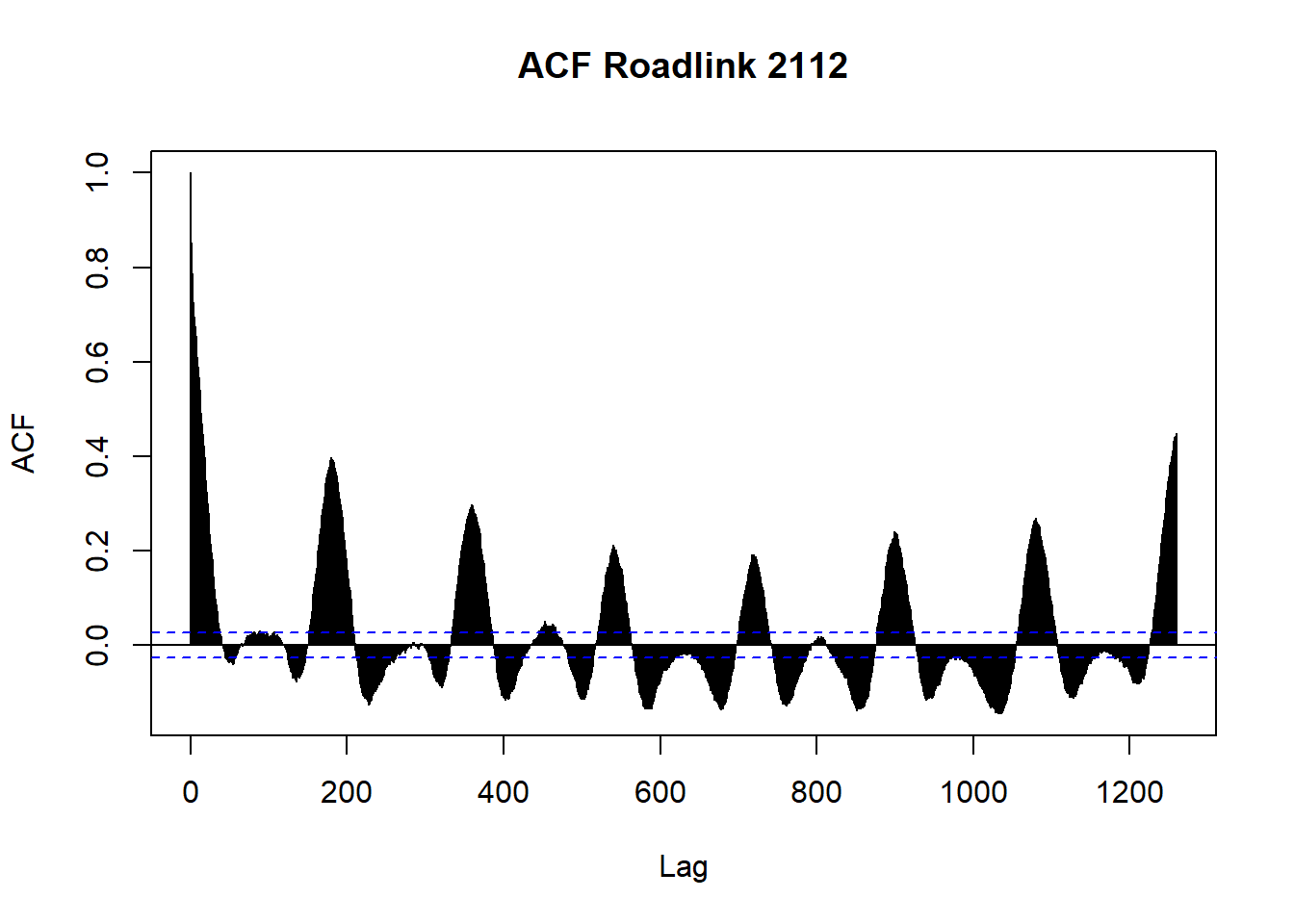
Figure 2.11: Temporal autocorrelation function of UTT at 1260 lags for road link 2112
In order to visualise the time series of all selected road links in a single view, we can use a heatmap as a visualisation method that can be used to look for patterns in a dataset. It allows relatively large datasets or correlation matrices to be visualised in a single view. We need data in matrix format as an input of the heatmap function.
Figure 2.12 presents a heatmap of autocorrelation at 180 lags, a single day of UTT data (x-axis), for the 28 selected road links of the study (y-axis). We can come to the evidence of a daily pattern of autocorrelation that could be explained by the travel times during peak hours, a common phenomenon during working days.
# Create the heatmap
ac <- acf(UJT.chosen, lag.max = 180, plot = FALSE)
acm <- t(ac$acf[,1,1])
for(i in 2:28){
  acm <- rbind(acm, t(ac$acf[,i,i]))
}
rownames(acm) <- colnames(UJT.chosen)

levelplot(t(acm), aspect="fill", xlab="TEMPORAL LAG",ylab="ROAD LINK ID")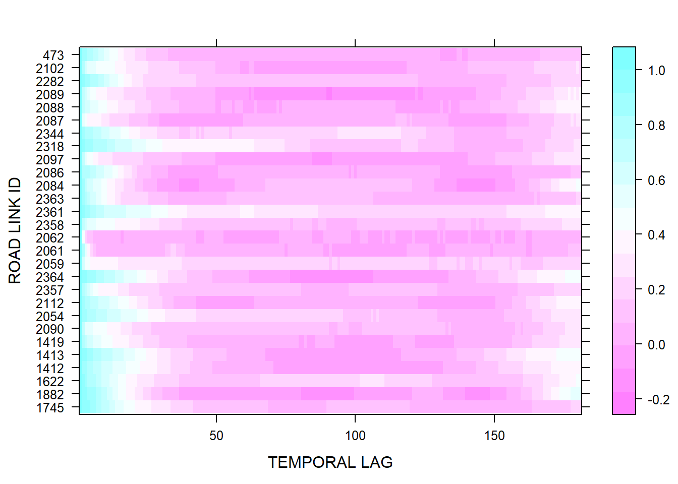
Figure 2.12: Temporal autocorrelation heatmap of selected road links: daily UTT in 01-01-2011
A space-time autocorrelation function must also be carried out to analyse the spatio-temporal relationship between road links on the network. To perform the analysis, a spatial weight matrix must be set-up. A spatial weights matrix is a representation of the spatial structure of the data. It is a quantification of the spatial relationships that exist among the features in your dataset. Conceptually, the spatial weights matrix is an \(N*N\) table (\(N\) is the number of features in the dataset). There is one row for every feature and one column for every feature. The cell value for any given row/column combination is the weight that quantifies the spatial relationship between these rows and column features.
There are two strategies for creating weights to quantify the relationships among data features: binary or variable weighting. For binary strategies (for example, fixed distance, K nearest neighbors, Delaunay triangulation, contiguity, or space-time window) a feature is either a neighbour (\(1\)) or it is not (\(0\)). For weighted strategies (inverse distance or zone of indifference), neighboring features have a varying amount of impact (or influence), and weights are computed to reflect that variation. Examples of non-binary weighting schemes include length of shared border between counties, proportion of shared perimeter or number of neighbours.
Spatial weight matrices are created in R using the spdep package. To construt the spatial weight matrix, we need first the adjacency matrix. A common procedure to calculate the spatial weight matrix is to calculate the distance between two adjacent links by their lengths. The functionknir::kable() is a simple table generator.
LCAPAdj.chosen <- LCAPAdj[c("2097","2318","2344","2087","2088","2089","2282","2102","473") ,
                          c("2097","2318","2344","2087","2088","2089","2282","2102","473")]

knitr::kable(LCAPAdj.chosen[]) | 2097 | 2318 | 2344 | 2087 | 2088 | 2089 | 2282 | 2102 | 473 | |
|---|---|---|---|---|---|---|---|---|---|
| 2097 | 0 | 0 | 0 | 1 | 0 | 0 | 0 | 0 | 0 |
| 2318 | 0 | 0 | 1 | 0 | 0 | 0 | 0 | 0 | 0 |
| 2344 | 0 | 0 | 0 | 0 | 0 | 0 | 0 | 0 | 0 |
| 2087 | 0 | 0 | 0 | 0 | 0 | 0 | 0 | 0 | 0 |
| 2088 | 0 | 0 | 0 | 0 | 0 | 0 | 0 | 0 | 0 |
| 2089 | 0 | 0 | 0 | 0 | 0 | 0 | 0 | 0 | 0 |
| 2282 | 0 | 0 | 0 | 0 | 0 | 0 | 0 | 0 | 0 |
| 2102 | 0 | 0 | 0 | 0 | 0 | 0 | 0 | 0 | 0 |
| 473 | 0 | 0 | 0 | 0 | 0 | 0 | 0 | 0 | 0 |
ws <- read_excel("tts.xlsx",
                 sheet = "Sheet3", range = "B1:AC29")
wm <- data.matrix(LCAPAdj.chosen * ws)
knitr::kable(wm[15:28,15:28]) | 2358 | 2361 | 2363 | 2084 | 2086 | 2097 | 2318 | 2344 | 2087 | 2088 | 2089 | 2282 | 2102 | 473 |
|---|---|---|---|---|---|---|---|---|---|---|---|---|---|
| 0 | 0 | 0 | 0 | 0 | 0 | 0.000 | 0 | 0 | 0.000 | 0 | 0 | 0.000 | 0 |
| 0 | 0 | 0 | 0 | 0 | 0 | 0.000 | 0 | 0 | 0.000 | 0 | 0 | 0.000 | 0 |
| 0 | 0 | 0 | 0 | 0 | 0 | 0.000 | 0 | 0 | 0.000 | 0 | 0 | 0.000 | 0 |
| 0 | 0 | 0 | 0 | 0 | 0 | 0.000 | 0 | 0 | 0.000 | 0 | 0 | 0.000 | 0 |
| 0 | 0 | 0 | 0 | 0 | 0 | 0.000 | 0 | 0 | 0.000 | 0 | 0 | 0.000 | 0 |
| 0 | 0 | 0 | 0 | 0 | 0 | 0.000 | 0 | 0 | 0.000 | 0 | 0 | 0.000 | 0 |
| 0 | 0 | 0 | 0 | 0 | 0 | 0.000 | 0 | 0 | 0.000 | 0 | 0 | 2115.902 | 0 |
| 0 | 0 | 0 | 0 | 0 | 0 | 0.000 | 0 | 0 | 0.000 | 0 | 0 | 0.000 | 0 |
| 0 | 0 | 0 | 0 | 0 | 0 | 0.000 | 0 | 0 | 0.000 | 0 | 0 | 0.000 | 0 |
| 0 | 0 | 0 | 0 | 0 | 0 | 0.000 | 0 | 0 | 1914.014 | 0 | 0 | 0.000 | 0 |
| 0 | 0 | 0 | 0 | 0 | 0 | 0.000 | 0 | 0 | 0.000 | 0 | 0 | 0.000 | 0 |
| 0 | 0 | 0 | 0 | 0 | 0 | 0.000 | 0 | 0 | 0.000 | 0 | 0 | 0.000 | 0 |
| 0 | 0 | 0 | 0 | 0 | 0 | 2115.902 | 0 | 0 | 0.000 | 0 | 0 | 0.000 | 0 |
| 0 | 0 | 0 | 0 | 0 | 0 | 0.000 | 0 | 0 | 0.000 | 0 | 0 | 0.000 | 0 |
To support determining if the data is stationary and the type of correlation, lag plots might be calculated for the first four lags of each road link. Figure 2.13 presents the plot for road link 2344. We can see that there is an increasing scatter with progressive lags due to the clustering around the slopes. Furthermore, it can be stated that temporal interdependence between consecutive observations is linear.
lag.plot(UJT.chosen[,"2344"], lags = 10, main= "ACF, 2344", do.lines = FALSE)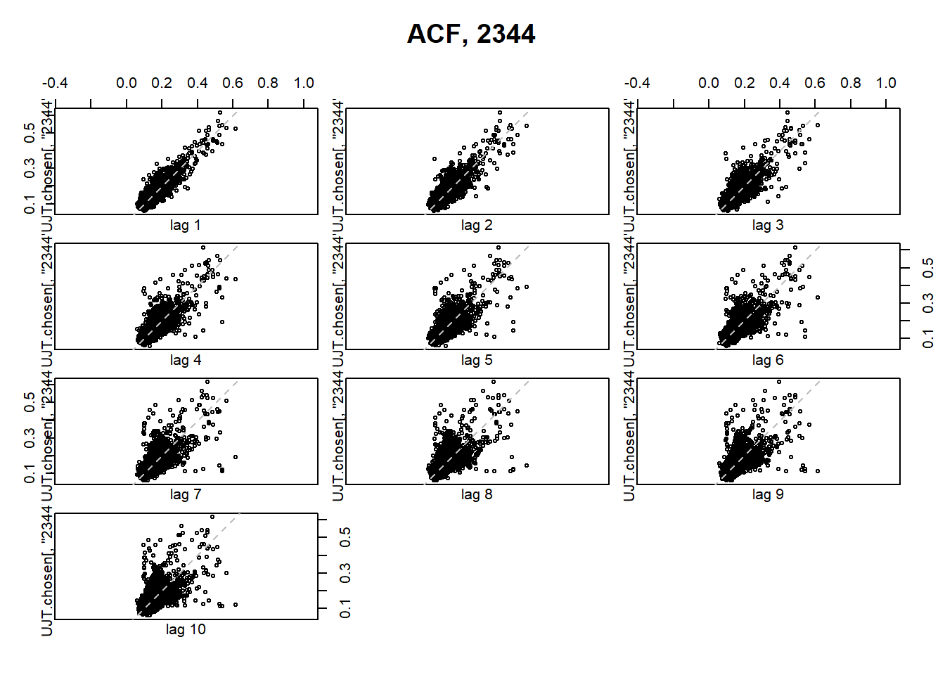
Figure 2.13: First ten lag plots for road link ID 2344
2.4 Chapter Summary
Exploratory spatial data analysis (ESDA) is the extension of exploratory data analysis (EDA) to the problem of detecting spatial properties of data sets where, for each attribute value, there is a locational datum.
EDA is a collection of descriptive techniques for detecting patterns in data, identifying unusual or interesting features, distinguishing accidental from important features and for formulating hypotheses from data. The set of exploratory techniques combines techniques that are visual (including charts, graphs and ®gures) and numerical but statistically robust. Among the many tools that enable the analysis of spatial relationships, are (auto)correlations, densities and clustering patterns.
ESDA is an extension of EDA to detect spatial properties of data: to detect spatial patterns in data, to formulate hypotheses which are based on, or which are about, the geography of the data and to assess spatial models.
References
Bell, M. G., and Y.Iida. 1997. Transportation Network Analysis. Wiley Publications.
Cheng, T, and J. Haworth. 2019. “Spatio-Temporal Data Analysis and Big Data Mining.” University College London.
Haworth, J. 2013. “Spatio-Temporal Forecasting of Network Data.” University College London.
Singleton, Spielman, A., and D. Folch. 2018. Urban Analytics. Spatial Analytics; GIS Series.
For more information, see https://tfl.gov.uk/modes/driving/congestion-charge↩
For more information, see https://plot.ly/r/getting-started/↩